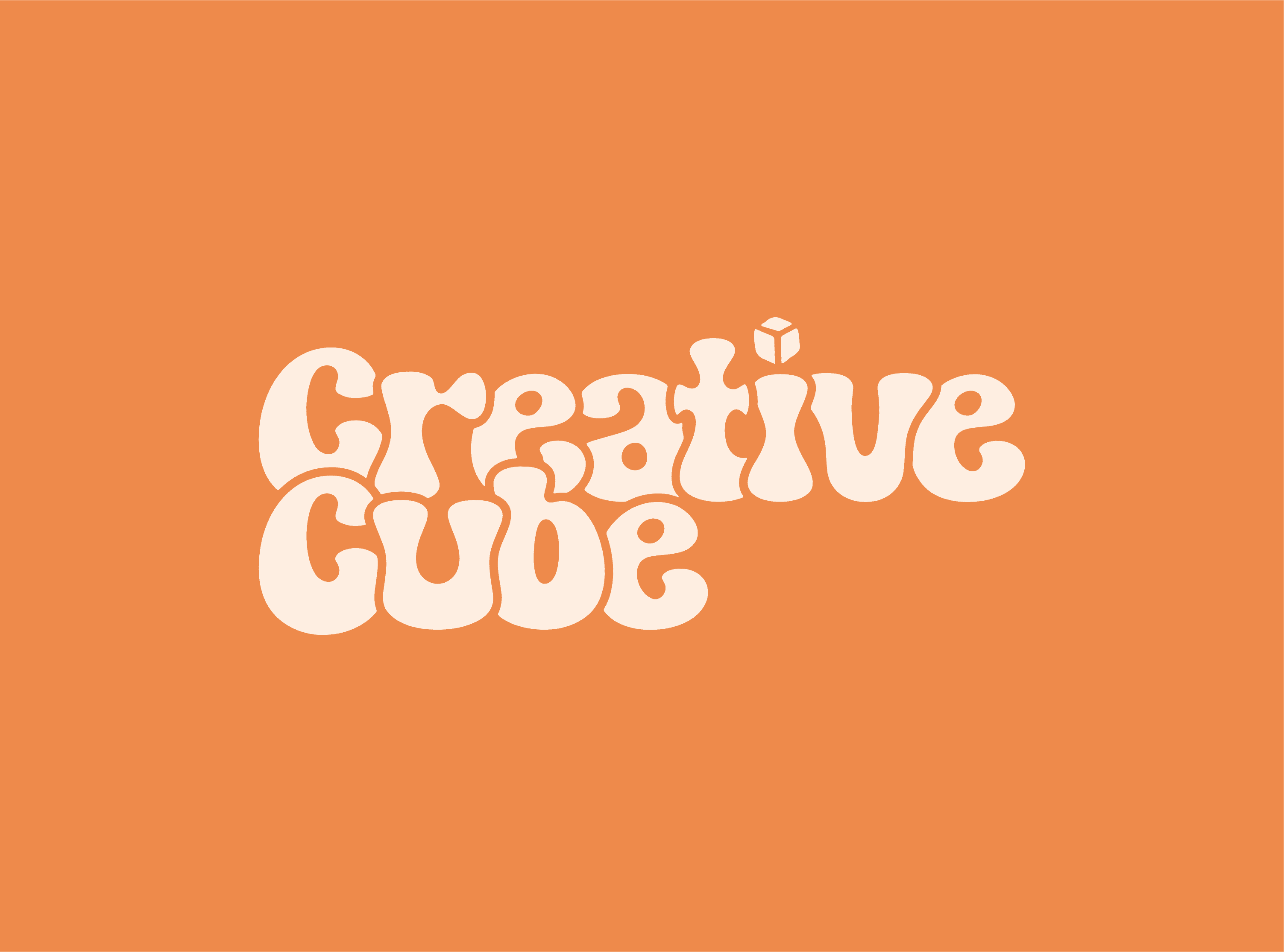
Creative Cube needed a brand identity that stood out while embracing fluidity and creativity and hired our creative agency to do the job. Awesome! We at Ramkonst designed a custom logotype with a wavy, organic structure that feels handcrafted and dynamic. The typography reflects freeform creativity while remaining structured, with a cube above the "i" reinforcing the brand’s name. The design system includes a versatile icon set, a playful brand mascot, and a cohesive color palette to ensure consistency across digital and physical applications.

Problem
The challenge was to break away from traditional, rigid design patterns and create something more expressive. Many cube-based identities feel static and structured, but Creative Cube needed a brand that embodied movement and artistic energy. The goal was to balance playfulness with professionalism, ensuring that the brand felt modern, recognizable, and adaptable across different platforms.


Outcome
The final identity gives Creative Cube a strong, distinctive presence in the content agency space. The combination of bold typography, custom brand assets, and a playful mascot creates a recognizable and flexible visual language. This branding approach strengthens the company’s market position, ensuring a memorable and engaging identity that works across web, social media, and physical branding materials.